Friday, 12 March 2010
Final Evaluation of Music Magazine(powerpoint presentation)
Wednesday, 10 March 2010
Final contents page

This is my final contents page design and I have done several things since my last post. I have inserted an editors signature which imedietly made everthing look more professional and I am extremely pleased with it. I added in the album art for my CD cover and am happy with the way it looks; I think it looks extremely effective. After trying several different pictures in the blank space above the editorial, I decided on adding in a subscription box which also meant I could include more pictures with examples of alternate covers. This also makes the magazine appear more realistic, as if it has been around for a long time. A number and magazine website address is included which adds to the realism. I added in a background the the 'contents' headline to make it stand out and included and issue number, page number and the logo which is featured throughout the magazine. Finally, I added in the brand identity red and blue stars which help to draw the eye to the articles. The contents page is the piece I am the most please with as I think it looks the most professional.
Monday, 8 March 2010
Final cover
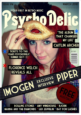
This is my final front cover design and I have made all adjustments to it. I am pleased with the outcome as I think it looks professional and I pleased with the impact the colour scheme makes. Since my last update I have added the details of the stars (red and blue) which I have made part of the brand identity. I used the stars as bullet points and also running along the top as a sort of fringe to the line that separates the main cover and the date and issue. I decided that I would have the word 'Free' in a large bold font on the round sticker as it would attract potential buyers. I filled in the artists name at the bottom and I made the blocks behind the text different lengths to make it more visually interesting. The coverlines and quotes were difficult to be seen without a black backing as they blended into the image not matter what colour I tried. I really like the way it turned out as it looks as if the coverlines have been pasted on. I added in the price above the barcode, as this is where they normally are (though I tried it at the top with the date and issue number at first.) The dotted background behind the banner is printed on the magazine but I have elongated the ends so it looks like a cardboard wrap around over the top. This would stop people looking inside the magazine and encourage them to buy to see what is inside.
Monday, 1 March 2010
Final Double Spread Page
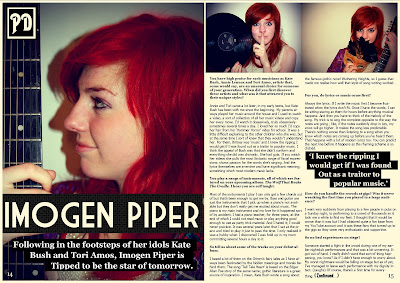
This is my final update on my double spread page. Since my last update I have given a background to the standfirst so that the writing is now visible and I have done the same with the quote in the middle of the article so that it looks like part of the magazine design. I added the page numbers to make the page look like it really comes from a magazine and also included the logo in the top left corner. I think If I now made any more adjustments, the page would just become cluttered. If I was to do anything, it would be to add the brand identity stars in blue and red but I think the page is fine as it is. I think it looks professional and the I am very happy with the vibrancy of the colours in the images. They leap off the page and will do well to hold the readers attention.
Sunday, 28 February 2010
Double Spread Page Update
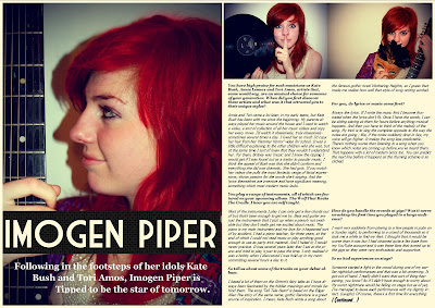
Since my last update I have made several changes to my double spread page. Firstly, I have changed the main image and article around so that now the model is looking off into the distance. This makes the picture more visually interesting for the reader and allows them to ask questions about the musician that they could not before. I have also created a gap in which I am going to insert a quote from the article. The title of the article is spread across the one page and I might change it so that it stretches across it both pages. The problem with this is that there would be less room for the article if I did this and I don't really want to cut off any of the questions midway. The stand first will need to be changed as it is difficult to read. I tried out several different font colours and this was the most visible- it will most likely need a black background like on the front cover or it will remain difficult to read. I switched the order of the smaller photos and I think they now blend together a lot better. I like the contrast; one has a blue tinge, one had a brown. My next step would be to add in the final details, such as the page numbers and magazine logo to add authenticity. I am considering adding in some of the brand identity stars, though I'm not sure where they would fit in and if they did, whether it would make the page look cluttered.
Saturday, 27 February 2010
Front Cover Update

Since my last update I have added a background to my banner as I had considered, because it makes the text look clearer. I am going to add in some sort of free offer into the red/brown circle below it, but I'm not sure what it will be offering yet. I could either fit a lot of small text into it or a very small amount in a large font. I am thinking the latter because then I could include the word 'Free' in a large font which would be an incentive to buy for the readers. I have started a list of artists at the bottom which are broken up by red and blue stars. I want to use this as a sort of brand identity, incorporated throughout the magazine and used instead of bullet points. I am using the same font throughout for most of the writing so that all the pages are linked in the magazine. I have added a bar code and when I did, the cover immediately looked more authentic. I placed it on the far right which is common on all types of magazines. After trying the tagline at the bottom left and right, I put it above the masthead as it fitted perfectly in the gap between the 'P' and 'D' of the masthead. As in many magazines, I have placed the date and issue number right at the top and kept it a dark colour so as not to cover the feathers of the mask in the picture. I didn't want to attract attention away from the rest of the text on the page. My next step would be to fill in the coverlines and add in the final details such as the brand identity of the stars.
Contents page update
Since my last update, I have mostly focused on inserting text and choosing the best font for each purpose. I added in the title of the fictional artists album but have yet to decide which image I should use for the album art. I inserted all the artiles and filled in all the page numbers, which took me a long time as I had to work out how long each article would be and where about it would fit in the magazine. I inserted the dotted background behind 'regulars' and 'on this weeks cover' which is the same I used on the banner on the front page. This is a style I want to run through the entire magazine. I added in an editorial to make it look more professional and I am looking for an appropriate font for the editor's signature and I want to add in some pictures in the space above. I was planning to add in a section about magazine subscription but I can only fit a certain amount it. If I designed several different covers, I could include more pictures but at the same time, include a subscription section.
Sunday, 21 February 2010
Double Spread Page Update
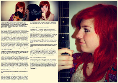
I have started my double spread page design by inserting the images and the interview so I could get a feel of how it was going to look. I inserted the text and images in a very basic way but put the text in collums, unlike my initial designs where it was in one block. I like the idea of have a large picture on the one page but I could make the two pages overlap by stretching the title across both pages. I am considering reversing the order of the article and the main image because, even though it's effective as the model looks like she's reading the article, it might be more effective to have her looking into the distance as it makes the reader think more about the picture. I also may reverse the order of the two smaller pictures as they meet in the middle by the collision of the model's hand and the record, and it may look better if they meet with blank space so blend more. Im not yet sure what to do with the blank space at the bottom of the article- I could perhaps put a quote there but move the article down so the quote is more in the centre. My next step would be to arrange the images so I am satisfied and then the extra bits of info such as the main title and the standfirst. I may put the standfirst above the article or on the opposite page below the title. The page looks a bit like I've thrown everything on at the moment and I will have to make changes to make it look more professional.
Contents Page Update
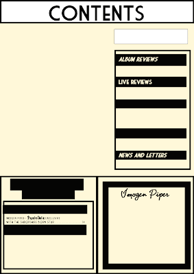
This is the first update of the final contents page for my music magazine. The first thing I have done is insert the columns for the regular features and the articles mentioned on the front cover. I inserted the information on the article for my double spread page as a starting point and the artists name where the album cover is going to be. I then inserted the heading for the different aspects of the magazine but I need to think of two more headings to fill the space. I have placed black backing behind the text as this links in with the front cover and double spread, where I have also done this. This makes it look part of the brand identity. I know what page number the double spread is going to be on so I inserted that number as a reference point. I need to make the contents title a little more interesting and eye catching and I might move it more off centre. I could leave the background behind it blank or add in a pattern to make it more eye catching. I might insert and image into the blank space, though I have been considering including an editorial there instead. My next step would be to fill the blank space and insert the main body of text.
Front cover update
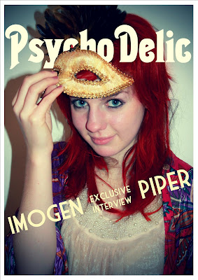
I have started my final design for my magazine cover. So far I have added the masthead (I choose a different font in the end from Dafont.com, as the one I had previously chosen didn't seem suitable) and a banner which mentions the featured artist. I am thinking about leaving the banner as I think it looks effective already. If I was to change it I would maybe put a darker background around it so it is clear and is visible over the photo. I also need to decided whether I want the tagline above or below the masthead. I like the feathers of the mask at the top of the page so am weary of putting anything over the top, so as not to ruin the image. I experimented with several different colours for the masthead before settling on white- partly because it was the most visible but also because it contrasts well with the colour of the model's hair. To get the masthead to sit behind the model's mask but not behind her head, I used Photoshop to erase the parts of the letters that covered the front of her hair. I wanted to re-edit the photo so that the hair colouring was neater but that would mean I would have to edit the mast head again and it took me a long time to do. The errors are not that visible so I think I will leave it as it is. The image I used was not one of the original ones that I edited but after trying out several, they were not suitable so I edited some alternate ones.
Saturday, 20 February 2010
Designs Update
Thursday, 18 February 2010
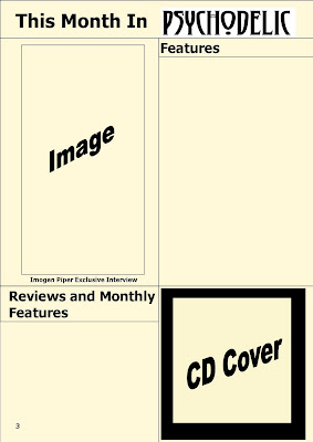
Contents Page Initial Designs
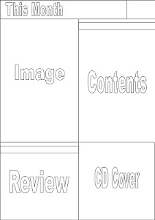 1.)
1.)1.) I think this is my best layout as it is clear and the text and images are at an diagonal, making it interesting to look at. I would like to include a CD cover of some kind and this would not take much designing as I would need a basic image and an unusual font, the latter of which, I could find on the internet. I could use an image from my photoshoot as an album cover and the album could be the musicians that it featured. The small box in the top right could be where my magazine logo goes and it could be in the same place on each page.
2.) I like this layout the least as I think it looks the least professional. Everything looks a bit squashed and I imagine that as I included more detail, it would look too cluttered. The images down each side would have to be small to fit in the slim gap which would mean they would be too small to see the detail. I also think the contents would looked strange just stuck in the middle of the page and it would look a lot better to the side. If I was to have the images down each side, I could design it so it looked like the negatives of old photographs- adding to the vintage look of the magazine.
3.) I've kept the top of the contents page the same throughout as I have decided that is where the magazine logo is going. I like this layout as the text and images are broken up which makes it easy to look at. I think that maybe the contents box is too big, considering there is also a separate box for reviews and competitions and I'm not sure what I would fill it with. I could make the contents box smaller so that I could include another image. Having a lot of images would make the magazine more believable as it gives an impression of size and how many articles are featured.
2.)

3.)

Front Cover initial ideas
 1.)
1.)2.)
3.)
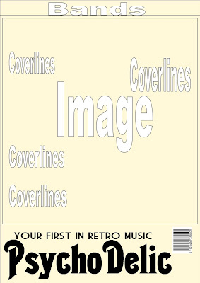
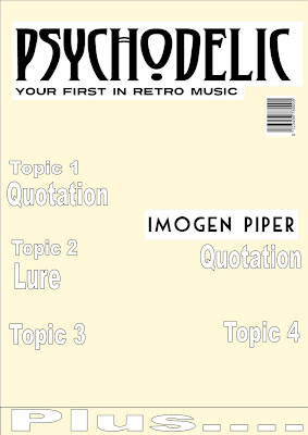
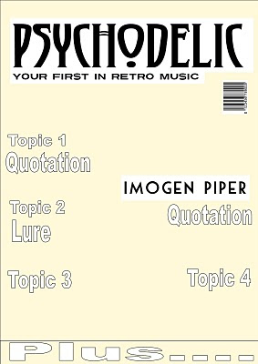
I have designed three front cover layouts for my music magazine. I added the background colour as this is the colour I have decided to use in my final magazine. I included the barcode which made it seem more athentic and allowed me to visualise the magazine.
1.) The first layout design is not particually conventional as it consists of a set area for coverlines and two images, one underneath the other. This goes against the convention of one large image with the coverlines over the top. I don't think this design is suitable as I think there is a convention for a reason; it looks a lot more professional and if you go against it in the way my layout does, it becomes cluttered and unorganised. I like the layout of the masthead and the tagline in this design and I think that is what I will be sticking with. I also like the idea of listing the bands at the bottom as it leaves room for articles in the coverlines- this way I still get to attract my readers through the big music names.
2.) This design is simple yet I think it's the one which is the most like the way I visilise my magazine. If I could change something it would be to put the tagline above the masthead rather than below it. I could have the masthead behind part of the image to make the picture look slightly three dimentional. The font I used on this layout is different and I don't really like the way it looks. I think I need to makes some changes to make the layout more interesting because at the moment, it is a bit plain.
3.) For this design, I put the masthead at the bottom rather than the top and I like the way it looks as it is non-conventional, but the page as a whole still holds many conventions, such as a large main image with the coverlines either side. There is rooms for a large image as well as a good amount of infomation above it. I think that instead of one large image, I could have four related ones together to make up a square. If I had pictures of the same artists pulling different facial expressions, or wearing different clothes in each one, this could be quite effective.
Double spread initial designs



1.)
2.)
3.)
I have designed three different layouts for my double spread page. I designed them in a simple way with indicators of where things might go so that I can get an idea without things becoming cluttered.
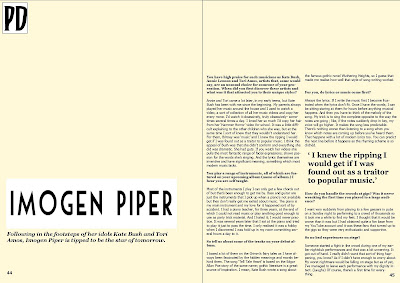
1.) This is the most simple of the three designs and consists of one main image that stretches across the two pages, along with a title and extra bits of info such as a quote. I think this is the weakest layout design as it immediately presents a problem; the text would be difficult to read because of the image in the background and the image would be difficult to see because of the text. If I could not find the appropriate font colour, I would have to mount the text on a coloured background which would obscure the image further. I do like the position of the title as it just slightly overlaps the opposite page and the quote being randomly placed within the article is an idea I'd like to use.
2.) I like this layout as the text and the images are clearly separated and so both can be seen. However, I don't think it is ideal layout to showcase an individual artists as there would not be room for a large close up of their face- I therefore think the layout is more suitable for a feature of a band as it could show a long shot of all the members. The quotation would be in the middle of the article and be interesting so that when the reader opened the page, it would be the first thing they saw. The title is large and clear although it would be better if it was on the left hand side because of the direction the reader turns the page- they would see the title first if it was on the left. The extra info at the bottom would be facts about the artist or something unrelated in the rest of the magazine.
3.) This is my favorite of the layouts and I inserted the article so I could get a clearer picture of what it would look like. I like that there is space for a large image of the artist which means the reader gets a better look at them but also room for another, long shot of them. The text would need to be ordered into collums as at the moment, it looks a bit plain and would put people off trying to read it. The title is large but would not obscure the main image and there is also room for a standfirst underneath. I think this will be the layout I use but I might try switching the picture and article the other way around.
Tuesday, 16 February 2010
Photo Editing: Hair colour change
1.) I first selected the paintbrush tool and chose the appropriate size to get accurate detail in the colouring. I then pressed 'Q' to create a mask over the hair and covered the area with this tool, pressing 'Q' for a second time once finished.
2.) I inversed the outline I had just created and then made a new fill layer, choosing a main colour and making the overlay softer so that it blended with the rest of the photo.
3.) I experimented with different colours to find one that suited the picture best and the chose the correct shade.
4.) Finally I adjusted the colour balance and used the selective colour option to make the red hair more vibrant and eye catching.
Friday, 12 February 2010
Photos before editing


I decided to upload the results of my photo shoot before I edited them so that the before and after can be seen. I will not use all of these images as I have decided I need one for the main cover, two for the contents page and three or four for the double spread page.
1.)I like the pose that my model is in in this photo although she is not looking at the camera so it would not be suitable as a cover image. The clothing she is wearing is bright and colourful and the mask is suitably theatrical and vintage. The image does create the question of what she is looking at which may make the reader think more about the image but if it was used, it would have to be used on either the contents page or the double spread as a smaller image.
2.) This image is of my model in action as she plays the piano and this definitely is not suitable for my cover image as there is not eye contact and the image isn't particularly interesting. I think the main problem is that you can't actually see that she is playing an instrument so it is unclear as to what she is doing. If is was to be included, it would be a very small image on the double spread page.
3.) I like this image as it is natural and shows the model's personality. She is not posing but just being herself allows her to connect with the reader and for them to empathise with her. It makes her look real and humanises her as a musician. The record and guitar are still present so the music references can still be see. This is not suitable for the front cover but may be used as a smaller image on either the contents page or double spread page.
4.) I like this picture as it is humorous and again, allows the reader to connect with the model. She is not looking at the camera so this would not be suitable for the cover image and I'm not really sure that the props used are appropriate. It does, however, show that the musician has quirky side.
5.) I really like the use of space in this picture. The model is on the far right with a black wall to the left. This lets the reader think about the image more and question it, rather than her being central. This is a possible candidate for the cover image as the model is looking directly at the camera, allowing her to connect with the audience and it shows off her personality and style (the guitar shows she is a musician and the mask and clothes she's wearing show off her quirky personal style. I also like the shadow of the guitar pegs as it makes it look like there are mulitple pegs. The fact that the model is looking out from being the mask makes her seems mysterious and the reader will want to know more.
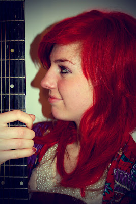
6.) I really like the pose the model is in as she looks as if she's looking at something out of sight, which would make the reader think. The guitar strings and neck are only visible which also makes the reader have to look closely to make out what she's holding. This could be used as the cover image even though there is no eye contact as the image itself is interesting enough. I could also have the coverlines running down the neck of the guitar which would be eye catching and encourage the reader to look closer.
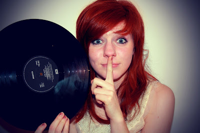
7.) I may use this photo as my main cover photo as the pose is interesting, there is a retro music related prop and the model is making good eye contact. She is also making a 'shush' gesture with her finger as if to say 'quiet and listen to the music.' The pose also makes her seem mysterious and makes the reader ask questions. The space is used well in this picture as there is still a good amount of blank wall visable (again, the model is focused to one side.) The reflections of light on the record are also effective and I could empathise this light when I edit the pictures.
8.) This picture would not be suitable for the front cover as it does not show the model's face and is quite a simple image. It would not raise many questions for the reader and would look quite plain. The amount of space surrounding her would be good as I would have a lot of room to include cover lines but the image isn't interesting enough to be featured. I could have it as the main or one of the smaller images on my double spread page though I would much rather it be used in a different way. I could offer it as a free poster to readers or use it as a cover for one of my artists albums. Even though it is not interesting enough to make the cover, it would be absract and interesting as an album cover.
9.) I don't think anything about this picture shows that the model is a musician and the props may confuse readers if this was featured on the front cover. Even though there is eye contact, the photo is too simple and uninteresting. I also think that the photo is too close to the model's face and there would be little space to include coverlines without blocking over her.
10.) I really like this picture as it shows all the music-related props. The picture is a long shot so it would be best used on the double spread page. I could use it spread across both pages and then overlay the interview (this may be difficult to see so I must consider visibility.) If I decide instead to use several images instead, I could offer this image as a free poster as it would be idea poster size.
Friday, 5 February 2010
Edited Photoshoot Pictures
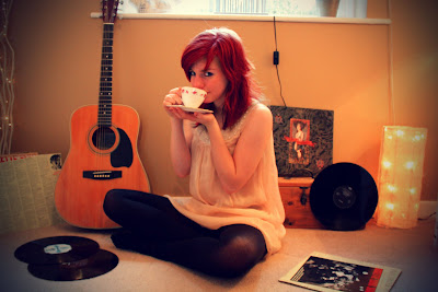
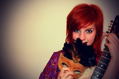
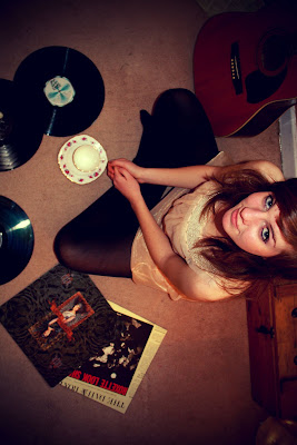
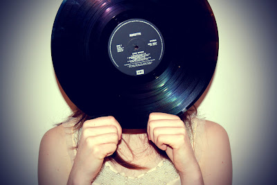
Thursday, 28 January 2010
Interview For Double Spread Page
Following in the footsteps of her idols Kate Bush and Tori Amos, Imogen Piper is tipped to be the star of tomorrow.
Questions:
You have high praise for such musicians as Kate Bush, Annie Lennox and Tori Amos, artists that, some would say, are an unusual choice for someone of your generation. When did you first discover these artists and what was it that attracted you to their unique styles?
Annie and Tori came a lot later, in my early teens, but Kate Bush has been with me since the beginning. My parents always played her music around the house and I used to watch a video, a sort of collection of all her music videos and copy her every move. I’d watch it obsessively, truly obsessively- sometimes several times a day. I loved her so much I’d copy her hair from her ‘Hammer Horror’ video for school. It was a little difficult explaining to the other children who she was, but at the same time I sort of knew that they wouldn’t understand her. For them, Britney was ‘music’ and I knew the ripping I would get if I was found out as a traitor to popular music. I think the appeal of Bush was that she didn’t conform and everything she did was dramatic. She had guts. If you watch her videos she pulls the most fantastic range of facial expressions; shows passion for the words she’s singing. And the lyrics themselves are inventive and have significant meaning, something which most modern music lacks.
You play a range of instruments, all of which are featured on your upcoming album (name of album.) I hear you are self taught.
Most of the instruments I play I can only get a few chords out of but that’s been enough to get me by. Bass and guitar are just the instruments that I pick up when a piano’s not available but they don’t really get me excited about music. The piano is my main instrument and my love for it happened sort of by accident. I had a piano teacher, for three years, at the end of which I could not read music or play anything good enough to use as party trick material. And I hated it; I would never practice. It was several years later that I sat at the piano and tried to play it just to pass the time. I only realised it was a hobby when I discovered I was hold up in my room committing several hours a day to it.
So tell us about some of the tracks on your debut album.
I based a lot of them on the Grimm’s fairy tales as I have always been fascinated by the hidden meanings and morals behind them. The song ‘Tell Tale Heart’ is based on the Edgar Allan Poe story of the same name; gothic literature is a great source of inspiration. I mean, Kate Bush wrote a song about the famous gothic novel Wuthering Heights, so I guess that made me realise how well that style of song writing worked.
For you, do lyrics or music come first?
Always the lyrics. If I write the music first I become frustrated when the lyrics don’t fit. Once I have the words, I can be sitting staring at them for hours before anything musical happens. And then you have to think of the melody of the song. My trick is to sing the complete opposite to the way the notes are going ; like, if the notes suddenly drop in key, my voice will go higher. It makes the song less predictable. There’s nothing worse than listening to a song when you know which notes are coming up before you’ve heard them. That happens with a lot of modern lyrics too. You can predict the next line before it happens as the rhyming scheme is so clichéd.
How do you handle the crowds at gigs? Was it nerve wracking the first time you played to a large audience?
I went very suddenly from playing to a few guys in pubs on a Sunday night to performing to a crowd of thousands so it took me a while to find my feet. I thought that it would be worse than it was but I had obtained quite a fan base from my YouTube account and it was these fans that turned up to the gigs so they were very enthusiastic and supportive.
So no bad experiences on stage?
Someone started a fight in the crowd during one of my earlier nightclub performances and that was a bit unnerving. It got out of hand. I really didn’t want that sort of thing happening, you know? As if I didn’t have enough to worry about. My worst nightmare would be falling on stage but as of yet, I’ve managed to leave each performance with my dignity intact. (Laughs) Of course, there’s a first time for everything.
Sunday, 24 January 2010
Masthead
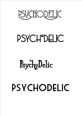
I have researched many different fonts and selected four that are inkeeping with the retro theme. I have also decided that the word PsychoDelic will be the full masthead instead of my originally planned 'PD' as it allows the masthead to showcase the retro theme in a more obvious way than just printing the initials. I found the fonts on the website www.dafont.com where I found many retro fonts inkeeping with the style I was trying to achieve. The fourth font is very similar to 'Mojo' magazine so I would be more likely to avoid this as I want to create something original. At the moment I am torn between the second and third font as I think they are the most appropriate. Any feedback would be appreciated.
The word Psychodelic can also be spelt Psychedelic but I chose to spell it the first way as 'psycho' is a more eye catching word and would draw peoples attention because of the dangerous element involved with the word.
Friday, 22 January 2010
Treatment Sheet
Target Readership: PD is targeted at young adults (20+) who are either already informed of retro music or are new to the genre. The reader may have a keen interest in all things retro such as clothing style and take preference for retro over modern music. They may enjoy modern music but like features of modern music that are noticeably influenced by older styles. They will be interested in attending concerts and performances but keen to hear reviews before spending money on tickets. They would fall into the C1/C2 socioeconomic group who can afford to spend money on extra things such as magazines and who can also afford to purchase the content advertised within the magazine such as CD’s, tickets and merchandise. They are more likely to be educated so the writing style would need to take this into account. They would have a passion for the music and because of this would be more likely to write in to voice their opinions of the acts they have seen or albums they have bought.
Form and Style: PD (which stands for Psychodelic) is an A4, full colour magazine released monthly which features information about new and old artists along with interviews and reviews of studio albums and live performances. Covers feature an artist dressed in period appropriate clothing depending on the era that the edition is focusing on or the artist’s personal style. The covers features either an older artist (a current picture or one from the past) or a new artist whose style has been influenced by an older, iconic artist. The clothing the new artist wears on the cover could possibly be similar to that of their music role models or they could recreate a pose of a previous famous artist. The magazine aims to inform a fresh audience of retro music and to provide a medium for those who are already fans. The magazine also comes with a free CD featuring tracks that are featured within the magazine so that the reader can understand what is being discussed.
Themes and Typical Features: The magazine will contain many typical features of music magazines with every issue containing interviews and exclusives with bands and musicians along with factual information about the artists. The magazine will make comparisons between older artists and up and coming musicians and showcase the new acts to add variety. This would also attract a younger audience as the music would remain in an older style but be updated for a younger generation. Every month, there will be a list of acts playing around the country and information such as the venue and dates the acts are performing. The music featured would always need to have been influenced by older music and encompass some of the features of older music. The writing style of the magazine will be mature as to fit with the target audience and the language that is used will be familiar to the audience. It will also feature exclusives which would attract an audience as they can not get the information anywhere else. CD’s due for release will be reviewed with a five star system to rate the music and there will also be a ‘if you liked this, then this is recommended’ feature where the reader can find similar artists to the one they enjoyed. A page would be included where readers could send in their opinion of live acts they have seen and rate them.
Potential Advertisers: Music companies could advertise their acts and records on separate pages or distributed through out the magazine on a whole page advertisement. Companies would include EMI, Warner, Universal, Sony and BMG among others. Companies that offer products in keeping with the retro/old fashioned feel could be included such as companies that sell vintage clothing or memorabilia.
Editorial Team: The editorial team for PD would consist of experienced writers who are mixed gender and a variety of age groups. This would add variety to viewpoints on the music featured; older members would have experienced the music when it was first released whilst younger members have discovered the music themselves. The younger writers would help to attract a younger audience as they have a fresh enthusiasm that they can pass on to their age group.
Q Magazine Contents Page Analysis

This contents page is an example of a contents page from the magazine Q. It contains a similar colour scheme to that of the cover (red, white and black) which is a colour scheme that runs through the entire magazine. It has one large, long shot photo which features a band that is interviewed within the magazine, as is captioned with the name of the band and a quote which is there to lure the reader. The list of contents has the main subject of the article in bold and then goes on to expand in small print. This allows the reader to see the main topic of the article and then have more infomation to help them decide whether to turn to it or not. 'Features' and 'Every Month' are surrounded by red which allows the reader to quickly find the content they want to read. The date and issue number is at the top which can also be featured on the front cover. The title of the magazine is also in the top left corner and this acts as a logo which runs throughout the magazine. The main band featured in the magazine is Oasis and there are many articles devoted to the band in this particular issue. I should think about this for my magazine and consider how much space I should put aside for my main artist. The page numbers are clearly shown as they are in bright red, and there is little red on the page. Using one, contrasting colour to highlight the most important infomation is an idea I would like to incorporate.
Thursday, 21 January 2010
Double Spread Page Analysis
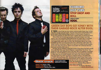
This double spread page features the band Greenday; half of the page being taken up by a large image of the band who are standing, legs apart in a powerful stance. This makes the band look important and mysterious. The band members are mostly wearing black which makes them look dark and mysterious. The colours of the article are bright and eye catching and the font is simple and easy to read. Using the word ‘kinky’ attracts attention as it is a suggestive word. The article uses a relaxed mode of address although it still uses sophisticated language such as ‘veteran.’ The ‘Back Track’ section gives the reader an extra bit of trivia which would be interesting for them to read. There is also an image of the band's album which is something I have choosen to include in my own magazine. I am undecided as to whether to include it on my double spread page or my contents page. There are several words that are in a different colour to highlight their importance. Words such as 'download' are highlighted which encourages the reader to do as their instruction. The layout of the double page are simple- one page has a full image and the other is mostly taken up by the article. The overlap of the backtrack box breaks up the separation of the text and images. The colour scheme makes the page look faded and a bit old, so I am considering using these colours for my magazine as it would make it look retro, which is the effect I want to achieve.
Wednesday, 20 January 2010
Example cover, contents and double spread
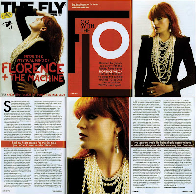
I wanted to post this image as it shows the cover, contents page and double spread of a music magazine (The Fly) and how all the pages interlink. The colour scheme of all pages are the same; black, orange and white, and this is because of the colour of the artists hair and clothes. I would maybe like to do something similar with my magazine, by having the colour scheme the same as the style of the artist featured. I am thinking of having my artist with red hair so I could use red on all areas of the magazine. This would mean that each edition of my magazine would have a different colour scheme, depending on the artist featured. I also like the simplicity of this magazine- with an image covering a whole page and then an article that is only interupted by a strip of colour. The magazine also has a symbol (a fly) and I could use this idea myself, having a logo or symbol that runs through all the pages.
Tuesday, 19 January 2010
Ideas For Photoshoot

2.)

I have decided that my magazine will mainly focus on older (retro) music so will most likely target an older teenage audience. I want the images featured to have a classy yet aged look and for the magazines image to be similar to that of Mojo or Q magazine. I have found several images and would like to create something similar. The pictures I take might be taken outside depending on what the featured article is about but I think my cover image will be taken against a blank or coloured wall. If I can not find the colour wall to match the feel of my image I could edit the model over a coloured background. I will have to search for the right outfits as the model will be dressed up quite theatrically and I will have to carefully plan the hair, makeup and props for the images. I have found several pictures which are the sort of thing I would like to produce. I think it is important to have images that have the model looking directly ahead as it helps to connect with the audience. I will find items (records and instruments) to dress the area when the photos will be taken which will make the photos look more authentic and professional. The colour scheme of the photos should be similar throughout so that they are linked and look part of the same photo shoot.
Sample Pictures:
1.) The picture contrast the model's pale skin with the vibrancy of her hair, an effect I'd like to achieve. I may have to digitally edit the colour of model's hair or lighten her skin tone. The model is also looking directly at the camera which helps her connect with the reader. The photo is simple yet effective as there are no extravagant costumes or any noticeably complex photo manipulation or techniques. The background of the photo is blurred out and does not distract from the model.
2.) This photo is in black in white and has been lightened to make the model's face glow, as if she is facing the light. This photo has a vintage look and the headpiece she is wearing shows that the model is from a time that is not our own. The background is simple black and white stripes which has the appearance of vintage wallpaper but is simple enough to not be distracting. The model is looking away from the camera and for my pictures, I think eye contact is important.
3.) This picture, unlike the previous images, is a long shot instead of a mid-close up. This would be ideal for my front cover as the model is not in the centre of the image so there would be space for cover lines and quotes without overlapping the image. There is a good balance of colour as the red is on her head, hands and lips, spreading the colour to the top and middle. The clothing is noticibly vintage and slightly theatrical which makes it interesting to lookt at. The red of her hat and glove draw attention to the model's face which means it is not necessary for it to be a mid-close up. The image has been edited to include light spots and the effect is that the picture looks like an old photograph that has been damaged by light over time. Though there are props in the background, the are white and simple so are not a distraction. I would very much like to produce an image like this, although maybe it would suitable for the main image of my double spread page.
4.) This image would be best suited to the double spread page as the model is facing away from the reader and it is more of a long shot to show the model surrounded by props than to show them as an individual. The props around him are suitably music related; a guitar, records, music posters etc. I could collect several of these objects to dress the set of my own photoshoot. The picture has a yellow tint which makes it look old and vintage. I am unsure about the pose of the model as it doesn't tell us or show us anything about him. I could do something simliar to this but have the model more forward facing.
ABC Figures
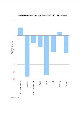

From these figures we can see that from Jan to June 2009, music magazine sales declined with the exception of Classic Rock and The Fly. This could be due to the current economic climate and recession which would mean people do not have the money to purchase magazines as they did before. The decline could also be due to the rise in the use of the internet, which offers much of the infomation found in music magazines,for free. This means that my music magazine would have to offer something that is 1.) worth the money and 2.) offers something that the readers can't get anywhere else.
Questionaire
-£1
-£2
-£3
-£4
2. How often should the magazine be released?
-Weekly
-Monthly
3. The magazine should target....
-Boys
-Girls
-Both
4. The magazine should target....
- Teenagers (13-16)
- Young Adults (16-20)
- Adults (20+)
5. What genre of music should the magazine specialise in?
-Pop
-Rock
-Indie
-Older music
-Alternative
-A mix of many
6. What should be offered as a free gift?
-CD
-Poster
-Other gift
-No gift
7.In a magazine, you have preference for....
-Text
-Images
-Equal mix of both
Monday, 18 January 2010
Kerrang Contents Page Analysis
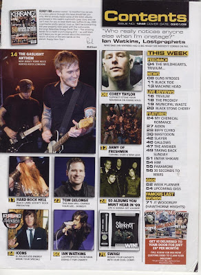 This is a sample contents page from the magazine Kerrang and it features many images of the bands included in the issue. Having these images helps to explain the contents in a clear, visual way. There is one main image and several smaller ones which means more can fit onto the page. There is an editorial note at the top next to a smaller image of the front cover and this is included on the contents page, though it is often separate. The colour scheme of white, black and yellow is the same colour scheme that runs throughout the magazine, including the cover and this is part of the brand identity. The different sections are clearly highlighted and surrounded by a black box which contrasts with the yellow writing, making the infomation easy to pick out.
There are also images of previous magazine covers at the bottom and an offer of subscription, something I might consider for my magazine. The box discussing the subscription is in red which attracts the eye and highlights its significance. A quote from a famous musician is included at the top and there is a different one each issue, giving the reader something interesting on the first page of every issue. Underneath each image there is a caption and a short explanation of the article. The article is still mentioned in the main contents list but the image at the side provides a visual aid. The background is pale and not distracting from the text- this would also mean the magazine would cost less to produce as it doesn't use a lot of ink to produce the background.
Friday, 15 January 2010
Action Plan
First Textual analysis and initial research
Week 2 - 4th January
Internet/magazine research- abc figures/publishers
Questionaire
Textual analysis
Week 3 - 11th January
Research colour and font
Textual analysis
Week 4 - 18th January
Draft layout
Plan photoshoot
Textual analysis
Week 5 - 25th January
Photoshoot
Textual analysis
Mock layout of cover and double page spread
Week 6 - 1st February
Textual analysis
Design
Week 7 - 8th February
Review questionaire feedback and adjust designs accordingly
Design alternative cover
Week 8 - 15th February
Content page design
Week 9 - 1st March
Finalise design
Week 10- 8th March
Evaluation
Wednesday, 13 January 2010
Kerrang Magazine Cover Analysis
 The magazine Kerrang is published by Bauer and targets a young audience who are interested in indie and rock music. The colours are bright and eye catching with a sharp contrast between the black, yellow and white. These are the colours of crime scene tape which adds an element of danger to the magazine and the other colour featured, red, is the colour normally associated with violence. Several of the banners sport terms such as 'Sex, drugs, violence' and 'the worlds most dangerous band.' All of these factors contribute to the magazines overall image of rebellion. Avenged Sevenfold is featured on the cover and this famous band would attract buyers and the lead singer is in the centre and slightly forward, highlighting that he is the most important member. The magazine offers a free poster which would encourage people to buy and the word 'free' is in bold white which makes it stand out. . There is also a large, white 'plus' which shows the reader that there is more inside the magazine, but they have to buy it first to access the content. There are also several other shots which are featured on the front cover which showcase the other bands inside the magazine. The strap line at the top features words like 'Mega' which adds to the excitement of the magazine by making the content sound larger than life. The names of the other bands are also in a font similar to a typewriter which makes it look as though the magazine was put together in a hurry; that it is raw which is a rebellion against the conventions of magazines. This adds to the whole idea of rebellion that the magazine is trying to portray. The coverlines are in red to draw attention to them, although not so much that it distracts from the main feature.
Mojo Magazine Cover Analysis
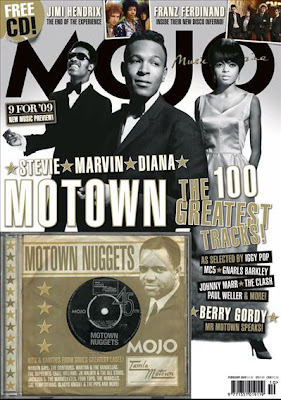 Mojo magazine is published by Bauer and features older bands rather than the current popular music. It's target audience would be between 25-50 and for those who prefer older music. It offers a sense of nostalgia for the bands of yesteryear but can also feature artists who have a similar style to previous musicians. The word 'Mojo' is a retro word which reflects the content and it is in large, black lettering behind the main image which makes the potential buyer have to take a closer look. The entire magazine has a retro feel to it with the black and white colour scheme and the gold makes the content look as if it is the best, better than anything else and that the music that is featured can not be bested. Three famous artists are on the front with their names beneath the image. This would make the reader want to buy the magazine as the artists are extremely famous in their genre but none of them are making eye contact with the audience; they are all looking off into the distance which makes them seem far away, in the past. The magazine also offers a free music CD featuring music which is discussed in the magazine. This not only acts as an incentive for the reader to buy but also attracts readers who don't know much about that type of music and can listen to what is being discussed without feeling alienated. Mojo could be called a niche product as it caters to those who prefer older or retro music as opposed to modern 'popular' music. There are also photos in colour at the top which shows that the magazine has modern elements to it; the main grey scale photo is still the highest impact image even though it is not the brightest. At the top is a 'Free CD' sign that looks battered and old, adding to the general theme of the magazine. Similarly, the photo featured on the CD cover looks worn with age, in a sepia tone which gives an idea of the music inside.


