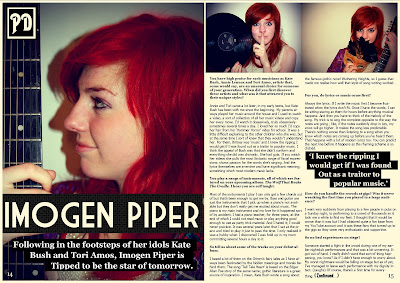
This is my final update on my double spread page. Since my last update I have given a background to the standfirst so that the writing is now visible and I have done the same with the quote in the middle of the article so that it looks like part of the magazine design. I added the page numbers to make the page look like it really comes from a magazine and also included the logo in the top left corner. I think If I now made any more adjustments, the page would just become cluttered. If I was to do anything, it would be to add the brand identity stars in blue and red but I think the page is fine as it is. I think it looks professional and the I am very happy with the vibrancy of the colours in the images. They leap off the page and will do well to hold the readers attention.

No comments:
Post a Comment