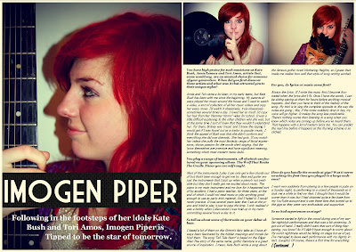
Since my last update I have made several changes to my double spread page. Firstly, I have changed the main image and article around so that now the model is looking off into the distance. This makes the picture more visually interesting for the reader and allows them to ask questions about the musician that they could not before. I have also created a gap in which I am going to insert a quote from the article. The title of the article is spread across the one page and I might change it so that it stretches across it both pages. The problem with this is that there would be less room for the article if I did this and I don't really want to cut off any of the questions midway. The stand first will need to be changed as it is difficult to read. I tried out several different font colours and this was the most visible- it will most likely need a black background like on the front cover or it will remain difficult to read. I switched the order of the smaller photos and I think they now blend together a lot better. I like the contrast; one has a blue tinge, one had a brown. My next step would be to add in the final details, such as the page numbers and magazine logo to add authenticity. I am considering adding in some of the brand identity stars, though I'm not sure where they would fit in and if they did, whether it would make the page look cluttered.

No comments:
Post a Comment