 1.)
1.)2.)

3.)

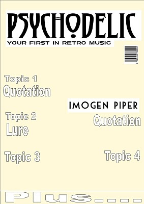
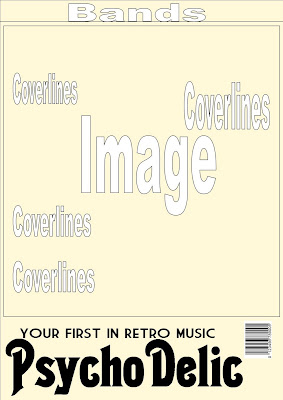
I have designed three front cover layouts for my music magazine. I added the background colour as this is the colour I have decided to use in my final magazine. I included the barcode which made it seem more athentic and allowed me to visualise the magazine.
1.) The first layout design is not particually conventional as it consists of a set area for coverlines and two images, one underneath the other. This goes against the convention of one large image with the coverlines over the top. I don't think this design is suitable as I think there is a convention for a reason; it looks a lot more professional and if you go against it in the way my layout does, it becomes cluttered and unorganised. I like the layout of the masthead and the tagline in this design and I think that is what I will be sticking with. I also like the idea of listing the bands at the bottom as it leaves room for articles in the coverlines- this way I still get to attract my readers through the big music names.
2.) This design is simple yet I think it's the one which is the most like the way I visilise my magazine. If I could change something it would be to put the tagline above the masthead rather than below it. I could have the masthead behind part of the image to make the picture look slightly three dimentional. The font I used on this layout is different and I don't really like the way it looks. I think I need to makes some changes to make the layout more interesting because at the moment, it is a bit plain.
3.) For this design, I put the masthead at the bottom rather than the top and I like the way it looks as it is non-conventional, but the page as a whole still holds many conventions, such as a large main image with the coverlines either side. There is rooms for a large image as well as a good amount of infomation above it. I think that instead of one large image, I could have four related ones together to make up a square. If I had pictures of the same artists pulling different facial expressions, or wearing different clothes in each one, this could be quite effective.

No comments:
Post a Comment