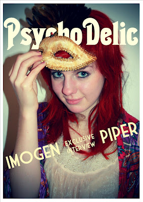
I have started my final design for my magazine cover. So far I have added the masthead (I choose a different font in the end from Dafont.com, as the one I had previously chosen didn't seem suitable) and a banner which mentions the featured artist. I am thinking about leaving the banner as I think it looks effective already. If I was to change it I would maybe put a darker background around it so it is clear and is visible over the photo. I also need to decided whether I want the tagline above or below the masthead. I like the feathers of the mask at the top of the page so am weary of putting anything over the top, so as not to ruin the image. I experimented with several different colours for the masthead before settling on white- partly because it was the most visible but also because it contrasts well with the colour of the model's hair. To get the masthead to sit behind the model's mask but not behind her head, I used Photoshop to erase the parts of the letters that covered the front of her hair. I wanted to re-edit the photo so that the hair colouring was neater but that would mean I would have to edit the mast head again and it took me a long time to do. The errors are not that visible so I think I will leave it as it is. The image I used was not one of the original ones that I edited but after trying out several, they were not suitable so I edited some alternate ones.

No comments:
Post a Comment