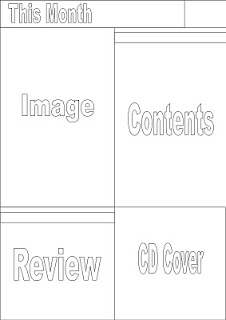
 1.)
1.)1.) I think this is my best layout as it is clear and the text and images are at an diagonal, making it interesting to look at. I would like to include a CD cover of some kind and this would not take much designing as I would need a basic image and an unusual font, the latter of which, I could find on the internet. I could use an image from my photoshoot as an album cover and the album could be the musicians that it featured. The small box in the top right could be where my magazine logo goes and it could be in the same place on each page.
2.) I like this layout the least as I think it looks the least professional. Everything looks a bit squashed and I imagine that as I included more detail, it would look too cluttered. The images down each side would have to be small to fit in the slim gap which would mean they would be too small to see the detail. I also think the contents would looked strange just stuck in the middle of the page and it would look a lot better to the side. If I was to have the images down each side, I could design it so it looked like the negatives of old photographs- adding to the vintage look of the magazine.
3.) I've kept the top of the contents page the same throughout as I have decided that is where the magazine logo is going. I like this layout as the text and images are broken up which makes it easy to look at. I think that maybe the contents box is too big, considering there is also a separate box for reviews and competitions and I'm not sure what I would fill it with. I could make the contents box smaller so that I could include another image. Having a lot of images would make the magazine more believable as it gives an impression of size and how many articles are featured.
2.)

3.)


No comments:
Post a Comment