

1.)
2.)
3.)
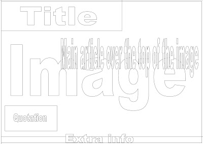
I have designed three different layouts for my double spread page. I designed them in a simple way with indicators of where things might go so that I can get an idea without things becoming cluttered.
1.) This is the most simple of the three designs and consists of one main image that stretches across the two pages, along with a title and extra bits of info such as a quote. I think this is the weakest layout design as it immediately presents a problem; the text would be difficult to read because of the image in the background and the image would be difficult to see because of the text. If I could not find the appropriate font colour, I would have to mount the text on a coloured background which would obscure the image further. I do like the position of the title as it just slightly overlaps the opposite page and the quote being randomly placed within the article is an idea I'd like to use.
2.) I like this layout as the text and the images are clearly separated and so both can be seen. However, I don't think it is ideal layout to showcase an individual artists as there would not be room for a large close up of their face- I therefore think the layout is more suitable for a feature of a band as it could show a long shot of all the members. The quotation would be in the middle of the article and be interesting so that when the reader opened the page, it would be the first thing they saw. The title is large and clear although it would be better if it was on the left hand side because of the direction the reader turns the page- they would see the title first if it was on the left. The extra info at the bottom would be facts about the artist or something unrelated in the rest of the magazine.
3.) This is my favorite of the layouts and I inserted the article so I could get a clearer picture of what it would look like. I like that there is space for a large image of the artist which means the reader gets a better look at them but also room for another, long shot of them. The text would need to be ordered into collums as at the moment, it looks a bit plain and would put people off trying to read it. The title is large but would not obscure the main image and there is also room for a standfirst underneath. I think this will be the layout I use but I might try switching the picture and article the other way around.

No comments:
Post a Comment