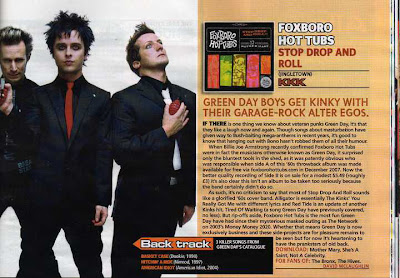
This double spread page features the band Greenday; half of the page being taken up by a large image of the band who are standing, legs apart in a powerful stance. This makes the band look important and mysterious. The band members are mostly wearing black which makes them look dark and mysterious. The colours of the article are bright and eye catching and the font is simple and easy to read. Using the word ‘kinky’ attracts attention as it is a suggestive word. The article uses a relaxed mode of address although it still uses sophisticated language such as ‘veteran.’ The ‘Back Track’ section gives the reader an extra bit of trivia which would be interesting for them to read. There is also an image of the band's album which is something I have choosen to include in my own magazine. I am undecided as to whether to include it on my double spread page or my contents page. There are several words that are in a different colour to highlight their importance. Words such as 'download' are highlighted which encourages the reader to do as their instruction. The layout of the double page are simple- one page has a full image and the other is mostly taken up by the article. The overlap of the backtrack box breaks up the separation of the text and images. The colour scheme makes the page look faded and a bit old, so I am considering using these colours for my magazine as it would make it look retro, which is the effect I want to achieve.

No comments:
Post a Comment