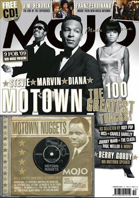
 Mojo magazine is published by Bauer and features older bands rather than the current popular music. It's target audience would be between 25-50 and for those who prefer older music. It offers a sense of nostalgia for the bands of yesteryear but can also feature artists who have a similar style to previous musicians. The word 'Mojo' is a retro word which reflects the content and it is in large, black lettering behind the main image which makes the potential buyer have to take a closer look. The entire magazine has a retro feel to it with the black and white colour scheme and the gold makes the content look as if it is the best, better than anything else and that the music that is featured can not be bested. Three famous artists are on the front with their names beneath the image. This would make the reader want to buy the magazine as the artists are extremely famous in their genre but none of them are making eye contact with the audience; they are all looking off into the distance which makes them seem far away, in the past. The magazine also offers a free music CD featuring music which is discussed in the magazine. This not only acts as an incentive for the reader to buy but also attracts readers who don't know much about that type of music and can listen to what is being discussed without feeling alienated. Mojo could be called a niche product as it caters to those who prefer older or retro music as opposed to modern 'popular' music. There are also photos in colour at the top which shows that the magazine has modern elements to it; the main grey scale photo is still the highest impact image even though it is not the brightest. At the top is a 'Free CD' sign that looks battered and old, adding to the general theme of the magazine. Similarly, the photo featured on the CD cover looks worn with age, in a sepia tone which gives an idea of the music inside.
Wednesday, 13 January 2010
Mojo Magazine Cover Analysis
 Mojo magazine is published by Bauer and features older bands rather than the current popular music. It's target audience would be between 25-50 and for those who prefer older music. It offers a sense of nostalgia for the bands of yesteryear but can also feature artists who have a similar style to previous musicians. The word 'Mojo' is a retro word which reflects the content and it is in large, black lettering behind the main image which makes the potential buyer have to take a closer look. The entire magazine has a retro feel to it with the black and white colour scheme and the gold makes the content look as if it is the best, better than anything else and that the music that is featured can not be bested. Three famous artists are on the front with their names beneath the image. This would make the reader want to buy the magazine as the artists are extremely famous in their genre but none of them are making eye contact with the audience; they are all looking off into the distance which makes them seem far away, in the past. The magazine also offers a free music CD featuring music which is discussed in the magazine. This not only acts as an incentive for the reader to buy but also attracts readers who don't know much about that type of music and can listen to what is being discussed without feeling alienated. Mojo could be called a niche product as it caters to those who prefer older or retro music as opposed to modern 'popular' music. There are also photos in colour at the top which shows that the magazine has modern elements to it; the main grey scale photo is still the highest impact image even though it is not the brightest. At the top is a 'Free CD' sign that looks battered and old, adding to the general theme of the magazine. Similarly, the photo featured on the CD cover looks worn with age, in a sepia tone which gives an idea of the music inside.
Subscribe to:
Post Comments (Atom)

No comments:
Post a Comment