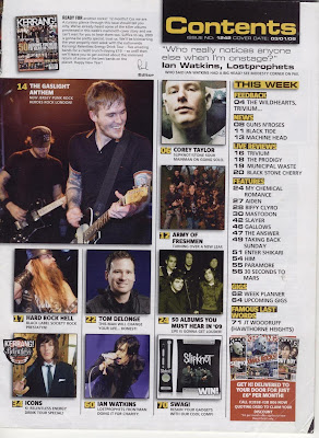
 This is a sample contents page from the magazine Kerrang and it features many images of the bands included in the issue. Having these images helps to explain the contents in a clear, visual way. There is one main image and several smaller ones which means more can fit onto the page. There is an editorial note at the top next to a smaller image of the front cover and this is included on the contents page, though it is often separate. The colour scheme of white, black and yellow is the same colour scheme that runs throughout the magazine, including the cover and this is part of the brand identity. The different sections are clearly highlighted and surrounded by a black box which contrasts with the yellow writing, making the infomation easy to pick out.
There are also images of previous magazine covers at the bottom and an offer of subscription, something I might consider for my magazine. The box discussing the subscription is in red which attracts the eye and highlights its significance. A quote from a famous musician is included at the top and there is a different one each issue, giving the reader something interesting on the first page of every issue. Underneath each image there is a caption and a short explanation of the article. The article is still mentioned in the main contents list but the image at the side provides a visual aid. The background is pale and not distracting from the text- this would also mean the magazine would cost less to produce as it doesn't use a lot of ink to produce the background.

No comments:
Post a Comment