Friday, 12 March 2010
Final Evaluation of Music Magazine(powerpoint presentation)
Wednesday, 10 March 2010
Final contents page

This is my final contents page design and I have done several things since my last post. I have inserted an editors signature which imedietly made everthing look more professional and I am extremely pleased with it. I added in the album art for my CD cover and am happy with the way it looks; I think it looks extremely effective. After trying several different pictures in the blank space above the editorial, I decided on adding in a subscription box which also meant I could include more pictures with examples of alternate covers. This also makes the magazine appear more realistic, as if it has been around for a long time. A number and magazine website address is included which adds to the realism. I added in a background the the 'contents' headline to make it stand out and included and issue number, page number and the logo which is featured throughout the magazine. Finally, I added in the brand identity red and blue stars which help to draw the eye to the articles. The contents page is the piece I am the most please with as I think it looks the most professional.
Monday, 8 March 2010
Final cover
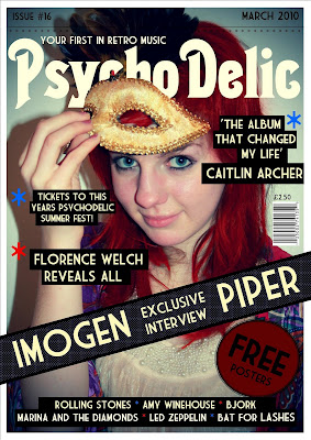
This is my final front cover design and I have made all adjustments to it. I am pleased with the outcome as I think it looks professional and I pleased with the impact the colour scheme makes. Since my last update I have added the details of the stars (red and blue) which I have made part of the brand identity. I used the stars as bullet points and also running along the top as a sort of fringe to the line that separates the main cover and the date and issue. I decided that I would have the word 'Free' in a large bold font on the round sticker as it would attract potential buyers. I filled in the artists name at the bottom and I made the blocks behind the text different lengths to make it more visually interesting. The coverlines and quotes were difficult to be seen without a black backing as they blended into the image not matter what colour I tried. I really like the way it turned out as it looks as if the coverlines have been pasted on. I added in the price above the barcode, as this is where they normally are (though I tried it at the top with the date and issue number at first.) The dotted background behind the banner is printed on the magazine but I have elongated the ends so it looks like a cardboard wrap around over the top. This would stop people looking inside the magazine and encourage them to buy to see what is inside.
Monday, 1 March 2010
Final Double Spread Page
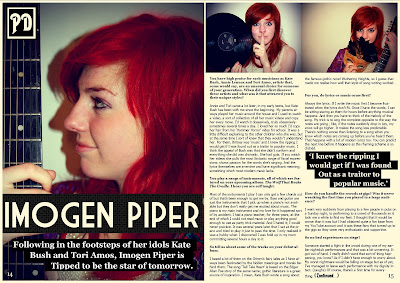
This is my final update on my double spread page. Since my last update I have given a background to the standfirst so that the writing is now visible and I have done the same with the quote in the middle of the article so that it looks like part of the magazine design. I added the page numbers to make the page look like it really comes from a magazine and also included the logo in the top left corner. I think If I now made any more adjustments, the page would just become cluttered. If I was to do anything, it would be to add the brand identity stars in blue and red but I think the page is fine as it is. I think it looks professional and the I am very happy with the vibrancy of the colours in the images. They leap off the page and will do well to hold the readers attention.
Sunday, 28 February 2010
Double Spread Page Update
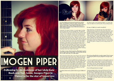
Since my last update I have made several changes to my double spread page. Firstly, I have changed the main image and article around so that now the model is looking off into the distance. This makes the picture more visually interesting for the reader and allows them to ask questions about the musician that they could not before. I have also created a gap in which I am going to insert a quote from the article. The title of the article is spread across the one page and I might change it so that it stretches across it both pages. The problem with this is that there would be less room for the article if I did this and I don't really want to cut off any of the questions midway. The stand first will need to be changed as it is difficult to read. I tried out several different font colours and this was the most visible- it will most likely need a black background like on the front cover or it will remain difficult to read. I switched the order of the smaller photos and I think they now blend together a lot better. I like the contrast; one has a blue tinge, one had a brown. My next step would be to add in the final details, such as the page numbers and magazine logo to add authenticity. I am considering adding in some of the brand identity stars, though I'm not sure where they would fit in and if they did, whether it would make the page look cluttered.
Saturday, 27 February 2010
Front Cover Update

Since my last update I have added a background to my banner as I had considered, because it makes the text look clearer. I am going to add in some sort of free offer into the red/brown circle below it, but I'm not sure what it will be offering yet. I could either fit a lot of small text into it or a very small amount in a large font. I am thinking the latter because then I could include the word 'Free' in a large font which would be an incentive to buy for the readers. I have started a list of artists at the bottom which are broken up by red and blue stars. I want to use this as a sort of brand identity, incorporated throughout the magazine and used instead of bullet points. I am using the same font throughout for most of the writing so that all the pages are linked in the magazine. I have added a bar code and when I did, the cover immediately looked more authentic. I placed it on the far right which is common on all types of magazines. After trying the tagline at the bottom left and right, I put it above the masthead as it fitted perfectly in the gap between the 'P' and 'D' of the masthead. As in many magazines, I have placed the date and issue number right at the top and kept it a dark colour so as not to cover the feathers of the mask in the picture. I didn't want to attract attention away from the rest of the text on the page. My next step would be to fill in the coverlines and add in the final details such as the brand identity of the stars.
Contents page update
Since my last update, I have mostly focused on inserting text and choosing the best font for each purpose. I added in the title of the fictional artists album but have yet to decide which image I should use for the album art. I inserted all the artiles and filled in all the page numbers, which took me a long time as I had to work out how long each article would be and where about it would fit in the magazine. I inserted the dotted background behind 'regulars' and 'on this weeks cover' which is the same I used on the banner on the front page. This is a style I want to run through the entire magazine. I added in an editorial to make it look more professional and I am looking for an appropriate font for the editor's signature and I want to add in some pictures in the space above. I was planning to add in a section about magazine subscription but I can only fit a certain amount it. If I designed several different covers, I could include more pictures but at the same time, include a subscription section.
Sunday, 21 February 2010
Double Spread Page Update
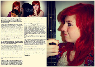
I have started my double spread page design by inserting the images and the interview so I could get a feel of how it was going to look. I inserted the text and images in a very basic way but put the text in collums, unlike my initial designs where it was in one block. I like the idea of have a large picture on the one page but I could make the two pages overlap by stretching the title across both pages. I am considering reversing the order of the article and the main image because, even though it's effective as the model looks like she's reading the article, it might be more effective to have her looking into the distance as it makes the reader think more about the picture. I also may reverse the order of the two smaller pictures as they meet in the middle by the collision of the model's hand and the record, and it may look better if they meet with blank space so blend more. Im not yet sure what to do with the blank space at the bottom of the article- I could perhaps put a quote there but move the article down so the quote is more in the centre. My next step would be to arrange the images so I am satisfied and then the extra bits of info such as the main title and the standfirst. I may put the standfirst above the article or on the opposite page below the title. The page looks a bit like I've thrown everything on at the moment and I will have to make changes to make it look more professional.
Contents Page Update
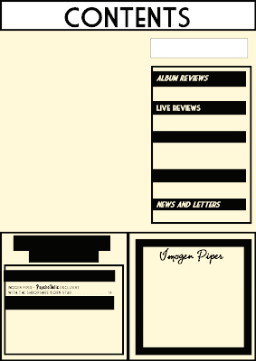
This is the first update of the final contents page for my music magazine. The first thing I have done is insert the columns for the regular features and the articles mentioned on the front cover. I inserted the information on the article for my double spread page as a starting point and the artists name where the album cover is going to be. I then inserted the heading for the different aspects of the magazine but I need to think of two more headings to fill the space. I have placed black backing behind the text as this links in with the front cover and double spread, where I have also done this. This makes it look part of the brand identity. I know what page number the double spread is going to be on so I inserted that number as a reference point. I need to make the contents title a little more interesting and eye catching and I might move it more off centre. I could leave the background behind it blank or add in a pattern to make it more eye catching. I might insert and image into the blank space, though I have been considering including an editorial there instead. My next step would be to fill the blank space and insert the main body of text.

