Friday, 12 March 2010
Final Evaluation of Music Magazine(powerpoint presentation)
Wednesday, 10 March 2010
Final contents page

This is my final contents page design and I have done several things since my last post. I have inserted an editors signature which imedietly made everthing look more professional and I am extremely pleased with it. I added in the album art for my CD cover and am happy with the way it looks; I think it looks extremely effective. After trying several different pictures in the blank space above the editorial, I decided on adding in a subscription box which also meant I could include more pictures with examples of alternate covers. This also makes the magazine appear more realistic, as if it has been around for a long time. A number and magazine website address is included which adds to the realism. I added in a background the the 'contents' headline to make it stand out and included and issue number, page number and the logo which is featured throughout the magazine. Finally, I added in the brand identity red and blue stars which help to draw the eye to the articles. The contents page is the piece I am the most please with as I think it looks the most professional.
Monday, 8 March 2010
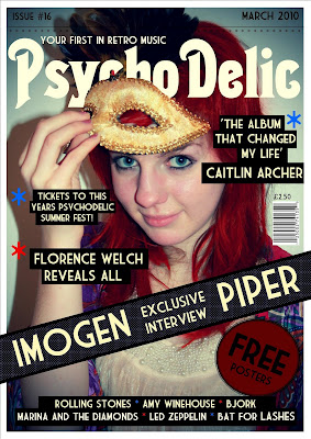
Final cover

This is my final front cover design and I have made all adjustments to it. I am pleased with the outcome as I think it looks professional and I pleased with the impact the colour scheme makes. Since my last update I have added the details of the stars (red and blue) which I have made part of the brand identity. I used the stars as bullet points and also running along the top as a sort of fringe to the line that separates the main cover and the date and issue. I decided that I would have the word 'Free' in a large bold font on the round sticker as it would attract potential buyers. I filled in the artists name at the bottom and I made the blocks behind the text different lengths to make it more visually interesting. The coverlines and quotes were difficult to be seen without a black backing as they blended into the image not matter what colour I tried. I really like the way it turned out as it looks as if the coverlines have been pasted on. I added in the price above the barcode, as this is where they normally are (though I tried it at the top with the date and issue number at first.) The dotted background behind the banner is printed on the magazine but I have elongated the ends so it looks like a cardboard wrap around over the top. This would stop people looking inside the magazine and encourage them to buy to see what is inside.
Monday, 1 March 2010
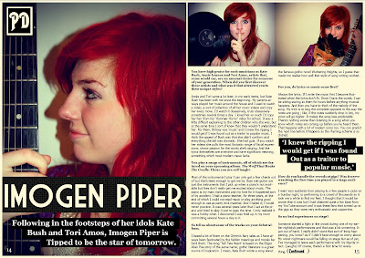
Final Double Spread Page

This is my final update on my double spread page. Since my last update I have given a background to the standfirst so that the writing is now visible and I have done the same with the quote in the middle of the article so that it looks like part of the magazine design. I added the page numbers to make the page look like it really comes from a magazine and also included the logo in the top left corner. I think If I now made any more adjustments, the page would just become cluttered. If I was to do anything, it would be to add the brand identity stars in blue and red but I think the page is fine as it is. I think it looks professional and the I am very happy with the vibrancy of the colours in the images. They leap off the page and will do well to hold the readers attention.
