
-In what ways does your media product use, develop or challenge forms and conventions of real media products?
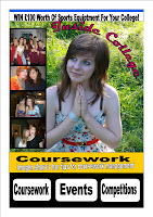
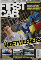
My student magazine includes many features of real student magazines. When I analysing First Car I could see that the colour scheme was bold and eye catching and after some audience feedback, I used a similar colour scheme of white, yellow and black. I included an eye catching banner and a strap line along with text and images. I think there is a good balance between text and images, as seen in First Car. The magazine has an eye catching central image which would be the main reason someone would pick up a magazine. I made sure that the contents page was similar to the colour in colour scheme and the way the smaller images were laid out which is a convention of magazines. I have included many interesting articles in my contents page which would be attractive for a young, student audience and the content is age appropriate.
-Who would be the audience for your media product?
The age group for my student magazine would be young adults aged 16-19 who would most likely attend college. I think my target audience is more liekly to be female due to the nature of the articles e.g. Fashion, and the fact that the main image on the cover is of a girl. This mean that girls would be more likely to pick it up than boys. My audience would generally be interested in doing well in education as many of the articles are about coursework and relieving exam stress. They would also be interested in socialising out of college.
-How did you attract/address your audience?
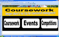
The central, medium close-up image would attract potential buyers as the colours are bright and eye catching. The model also looks like she is looking at the pictures to the side which makes people pay attention to them. The images themselves are varied and feature students smiling and having a good time. This attracts a young audience as they can relate to the people in the images. The bright banner that stretches across the front cover is eye catching and the contrast of black against yellow makes people pay attention to the headline. The words in bold at the bottom e.g. Coursework, makes people notice the words almost immedietly and they know straight away what is featured in the magazine.


-What have you learnt about technologies from the process of constructing this product?

To design my magazine cover and contents page I used Microsoft Pulisher and to produce the images for the Magazine I used a Canon EOS 1000D. I also used Adobe Photoshop to edit my central image and change the brightness and the contrast. This made the image more interesting as I found from my audience feedback that this was very important in influencing choice of magazines. Using Blogger is also an example of technology that I used.
-How does your media product represent particular social groups?
My magazine represents the sort of young adults who are interested in suceeding in education. They would be attracted by the idea of improving their coursework deadlines and similar tips on other aspects of education. It steers clear of any negative images of drinking or fast driving which could possibly have a negative effect and instead depicts students as hardworking but also able to take time off to relax. The amount of space taken by text and images are about the same but the text is larger which is more attractive to student audience as they do not have to spend time reading a lot of text to get a feel for the magazine.
-What kind of media institution might distribute your media product and why?
My student magazine would be distributed by the college and most likely funded by the student council.

No comments:
Post a Comment